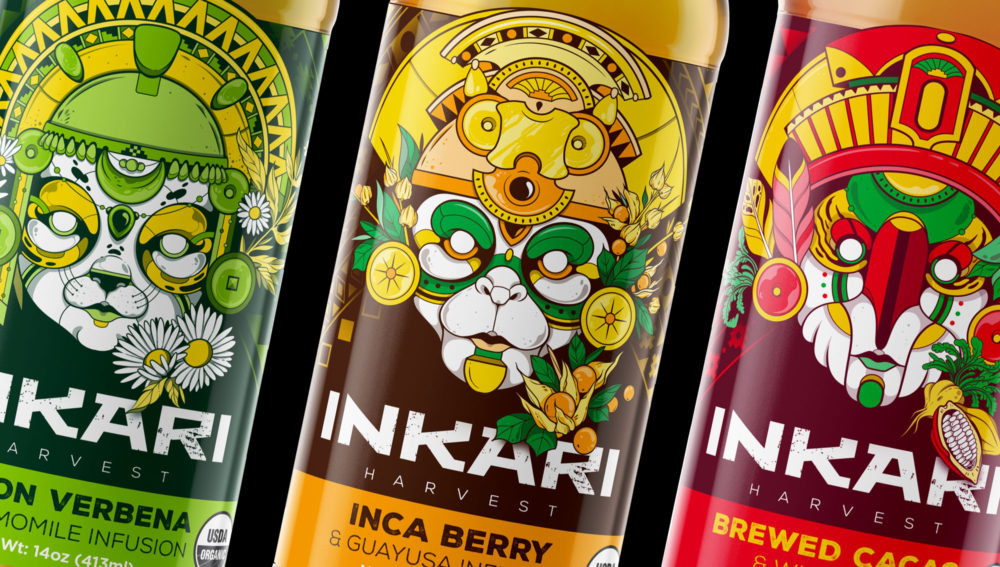
Kunapops.
The power of superfoods.
We were in charge of developing a series of products based on ingredients that come from our region. These superfoods carry an identity that reflects nutrition, joy, fun and origin. Also within its innovative formulation contain probiotics that help the preservation of your digestive system.


Functional snacks and cereals.
Within the initial development, the brand was growing and integrating new varieties of products. Thus maintaining its initial essence but at the same time providing it with differentiating elements for its recognition.


Kaolati.
Inkari.
Products with social responsability.
We were in charge of developing a new concept of tea. The main ingredients are grown and produced in South America, Ecuador and Peru. This product line includes: Arriba cocoa chocolate, maca, guayusa, golden berries, etc. One of the main social responsibility objectives of this brand was to help the animals of the Ecuadorian Amazon to return them to nature.


The return of the Inca warrior.
The main objective was to connect the idea of the Inca warrior portrayed in these animal masks. This warrior has the appropriate style of the time period that includes crowns, large gold earrings, face painting, etc. Also the representation of these masks evokes most representative animals in the main culture, most of them are symbols of strength and wisdom. As an example, the jaguar represents power, mystical darkness and sacred energies and is linked to political power in that particular period of time.


Illustration as a unique design factor.
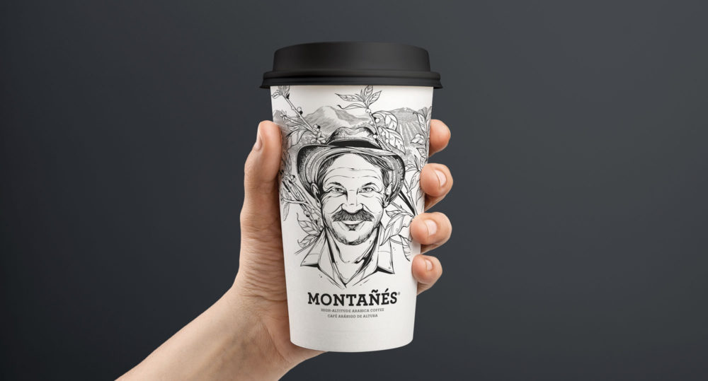
We use illustration as our main technique so that we can create a unique and striking style. By mixing all the main ideas as well as: Inca warrior, ingredients and social responsibility, we could find this interesting representation of each product. It is also important to mention that we can incorporate more products in the category without losing its main criteria.


In.
Nutritional supplements for today's athlete.
We develop a brand that captures the attention of athletes. Through the corporate use of their corporate colors we generate an image that presents a variety of specialized products for athletes. A purely typographic proposal was used to communicate the benefits and attributes of each product. The level of hierarchy of elements is maintained in each product thus creating a clear and direct communication system. This line has three product lines that it has expanded over time and currently has more than 15 products.


Montañes.
A coffee story born in Ecuador.
Montañés is a specialty of Arabic coffee; cultivated, selected and roasted by artisans in ecological farms in the southern highlands of Ecuador. It takes all the effort of the mad coffee grower, who is paid fairly for his work in the field, which starts from the selection of the best seeds, the care of his plants until his post harvest process. It is a coffee full of nuances and body, which brings an intense aroma and flavor, creating the perfect balance.
A character was developed that carries the characteristic guidelines of the brand, and through a system of stickers, a wide range of products are generated and alienated to establish the brand architecture.


Pure Nature
Redesigning a brand with a growing vision.
We were in charge of redesigning the Pure Nature product line. The identifying color range of each product was maintained, since there was a recognition of the product shelves. Additionally, we restructure the elements for a better readability of their benefits and attributes.


The importance of a sustainable graphic line over time.
When we create a packaging line it is important to consider that we must manage certain visual attributes that allow us to identify the brand. In addition, it is crucial that all the elements are linked together so that the consumer can identify new products that obviously belong to the same product line. This development includes food and treats for pets.
Wajuko.
The night guard.
Wajuko is a brand of guayusa infusions in Ecuador. The owl was used as the main symbol of this brand since it represents the mysticism and magic of the Amazon rainforest of Ecuador.
This animal is presented in an illustrative way in its natural habitat surrounded by lush guayusa trees that grow in the Amazon. Through the use of color we differentiate each one of the flavors and aromas to generate a product line expansion .


Natural energizer and antioxidant.
Wajuko has the energizing properties that your body needs to keep your mind active and your physical performance, thanks to its balanced content of natural caffeine beneficial to health.
Wajuko has the ability to neutralize free radicals, thanks to its antioxidant property, delaying the aging of your body's cells, giving an appearance of youth and vitality.

Quinoa Queen
Innovation in the cereal industry.
In this development we rescue two important factors: the ancestral and the natural. Through the use of illustration we wanted to connote natural and healthy elements that come from the main ingredient. In addition to an atypical use of layout that allows you to differentiate the design from the main competitors.


