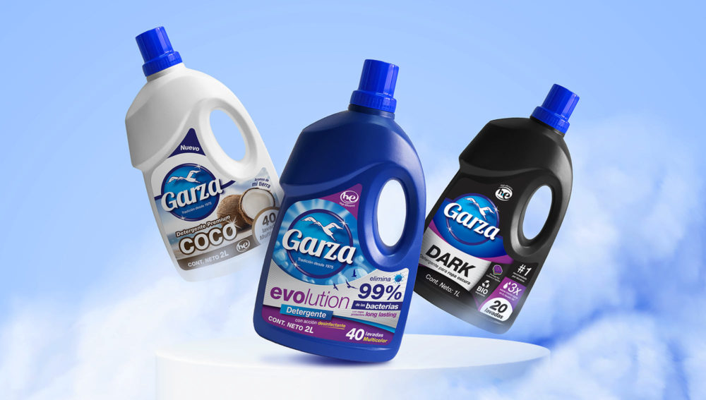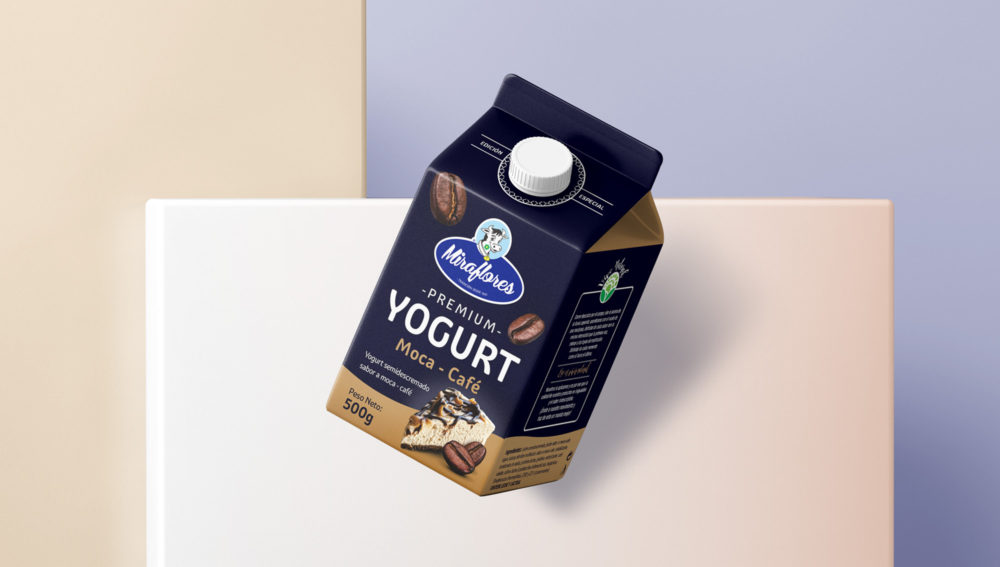
Chiki.
Celebrating culture.


The valley of longevity.


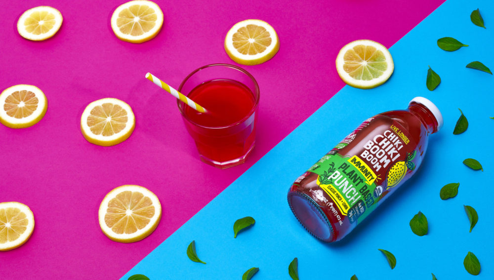
Colorful & powerful.


Celebrating culture.
The valley of longevity.
Colorful & powerful.
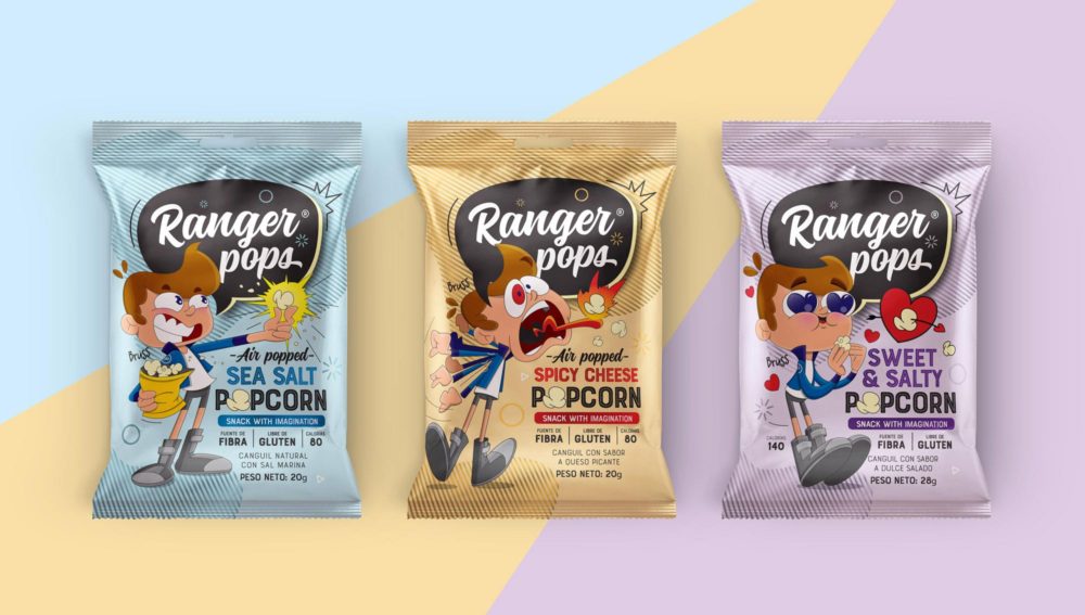
Creating stories through the brand.


Bruss the real ranger.


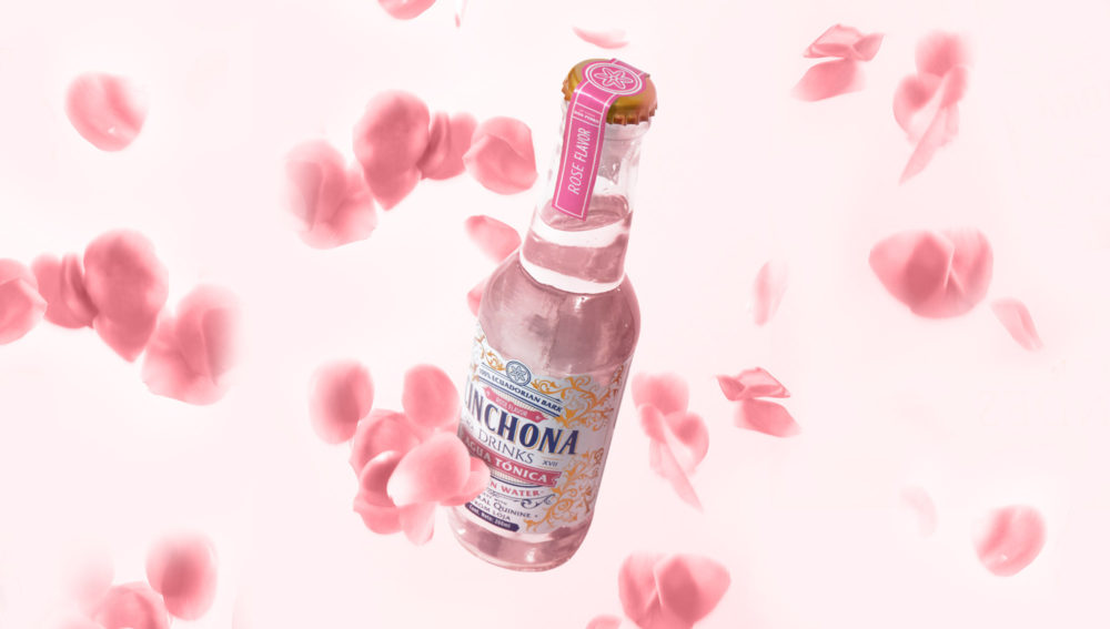
Discovering the origins of quinine.


Un dia, un jesuita del pueblo de Loja, cayó enfermo de malaria, acercándose así a la muerte. Don pedro, con el conocimiento de esta mágica planta, logro curarlo…
El sacerdote después de estar curado, logró tratar y sanar a una autoridad española de Loja. A su vez, esta autoridad curó a la esposa del virrey del Perú, el Conde de Chinchón, de donde viene el nombre que hoy le conocemos a la planta: Cinchona. Al ver las maravillas de la planta, el Conde se la llevó a Europa…
Este pequeño gesto de Don Pedro Leiva significó, no solo lavar la vida de un jesuita, pero se transformó después en la solución para tratar una de las enfermedades más letales de la humanidad, la malaria, salvando así a toda Europa sin ni siquiera darse cuenta.


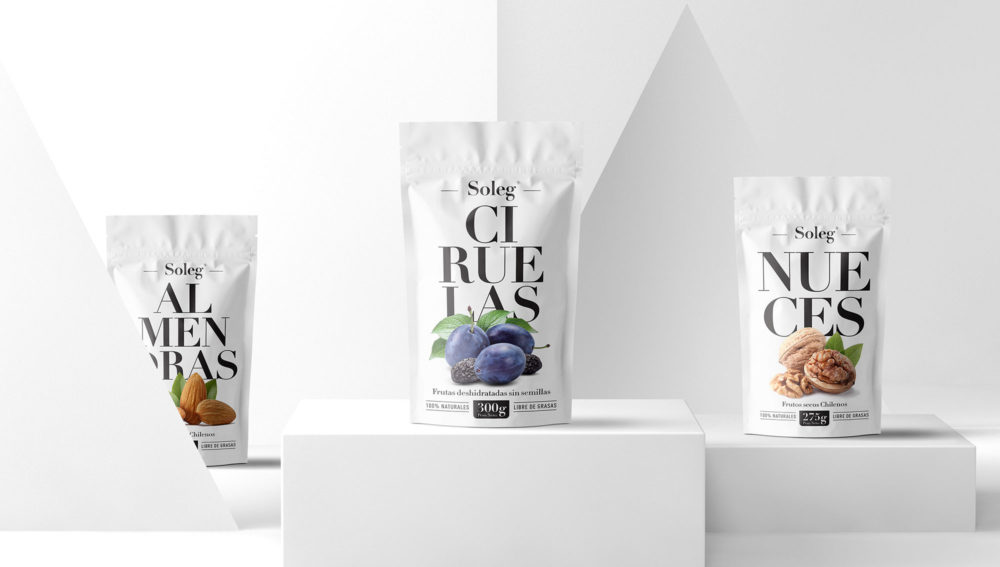
Contemporary design evoking bygone eras.


Minimizing the environmental impact.


Sophistication and simplicity as brand hallmarks.


Brand Architecture.