
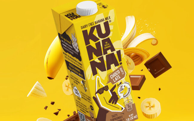
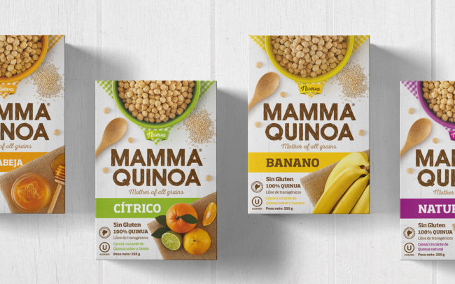
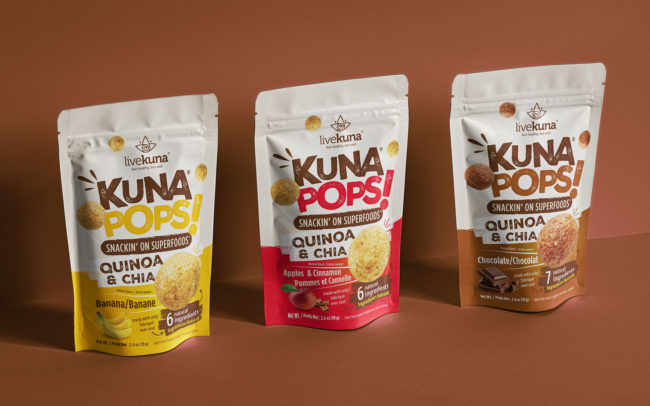


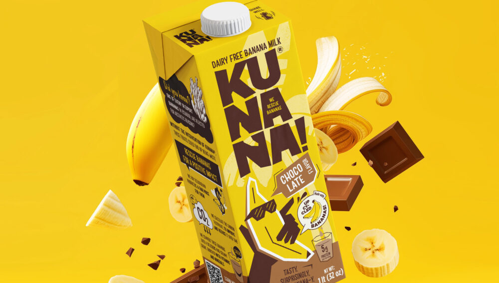
Kunana.
A brand with positive impact.


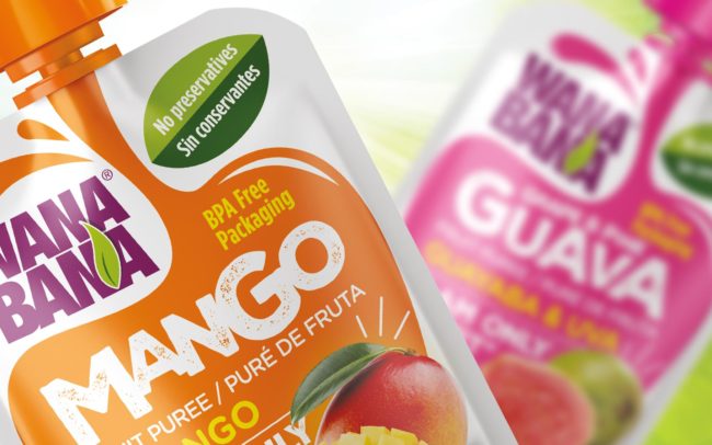
Made with rescued bananas.


Cool Bananas.


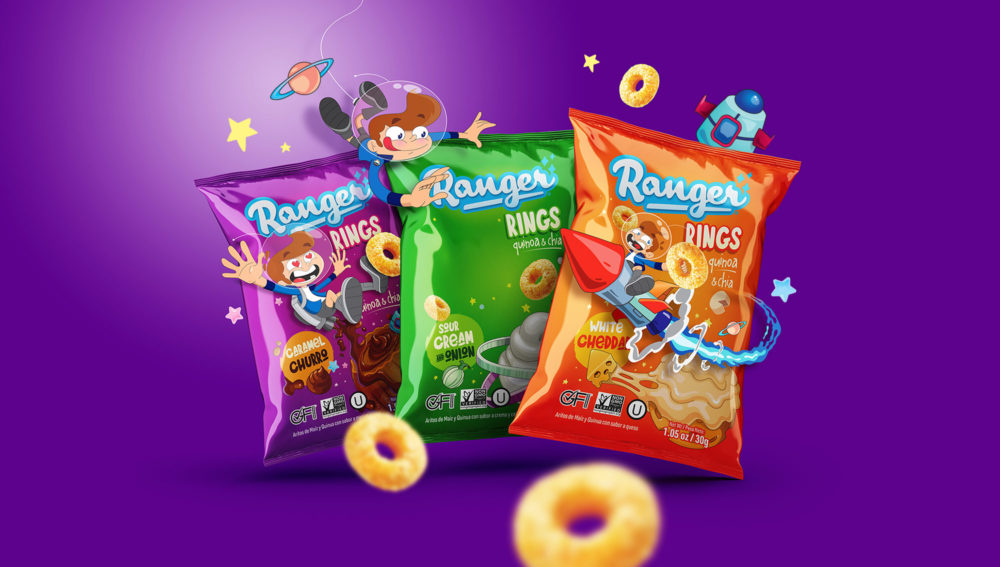
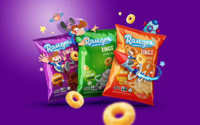
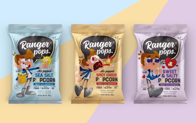
Ranger Rings.
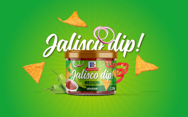
A snack full of adventures.


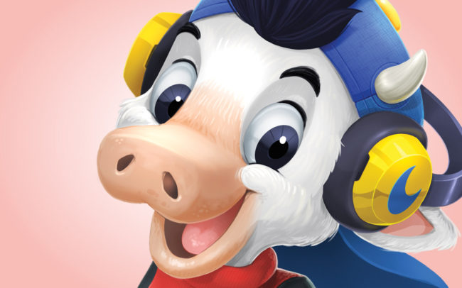
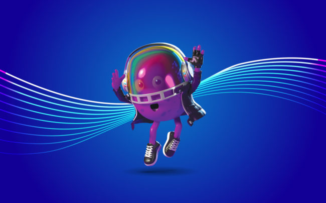
The Adventures of Bruss.


A galaxy full of flavor.


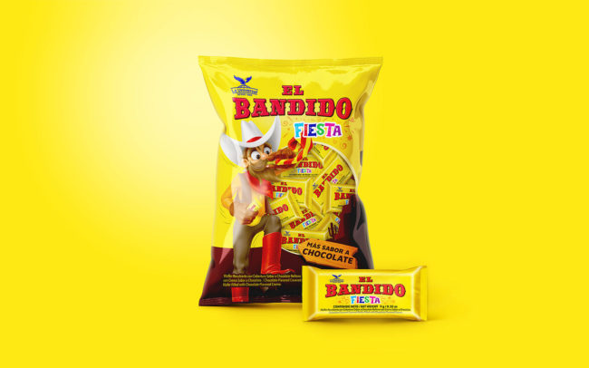
La Universal.
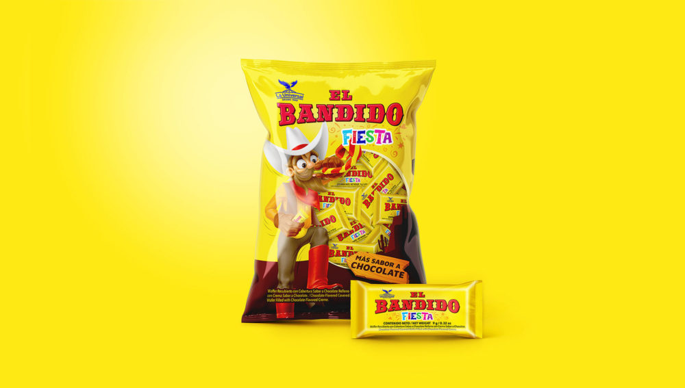
El Bandido.


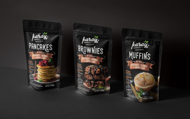
Products that helps the buyer consumer.
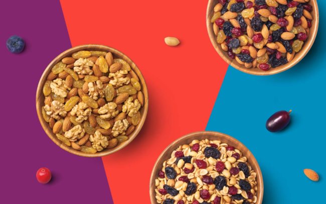
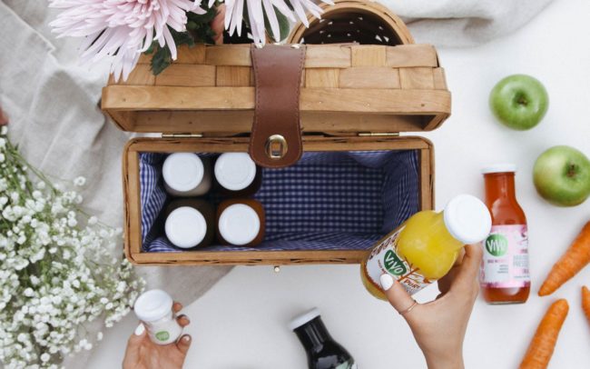
Season products.