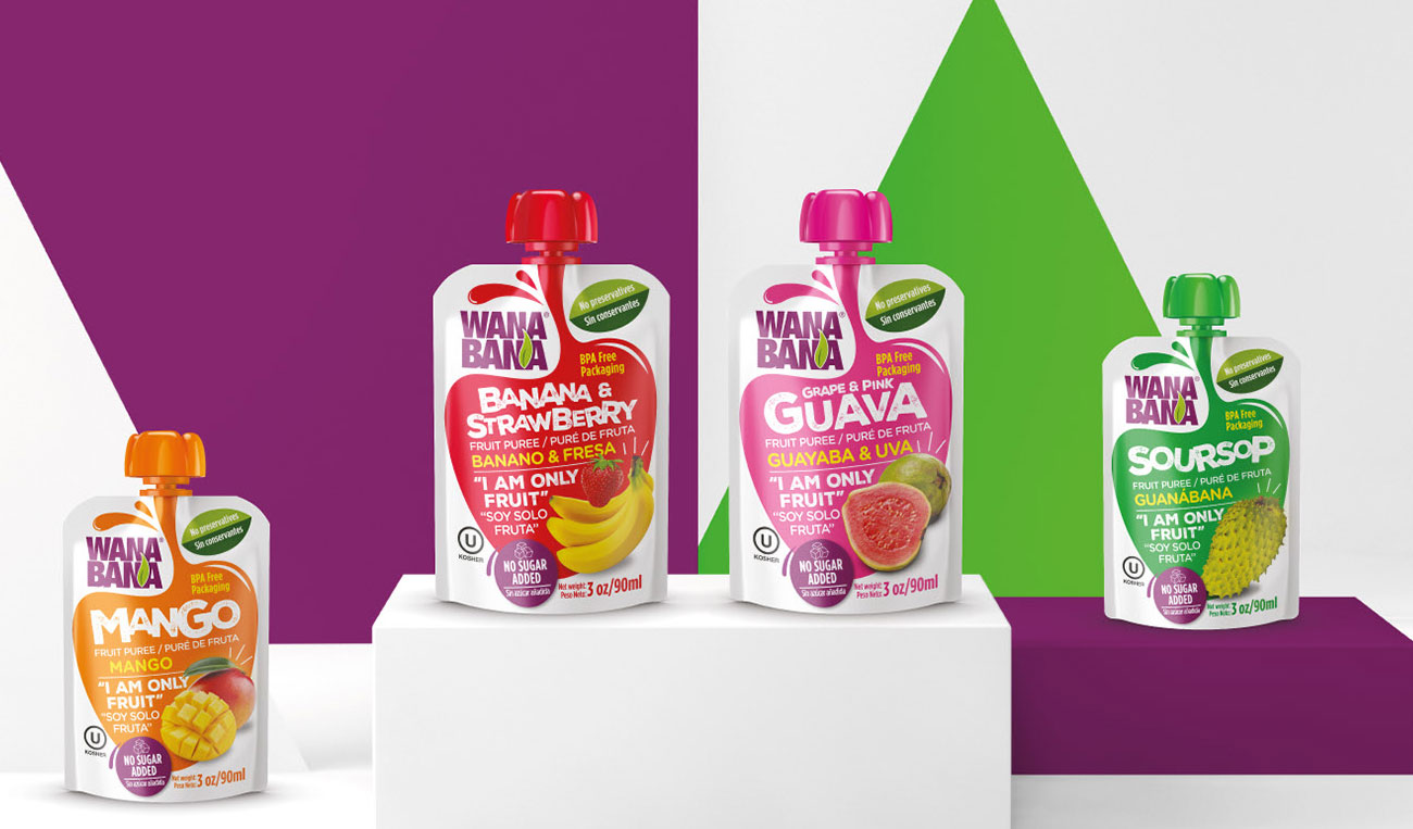
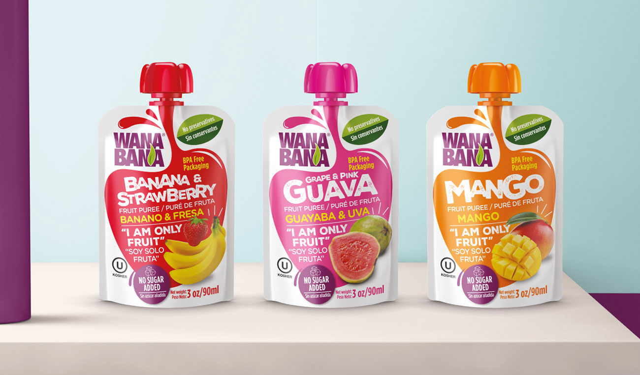
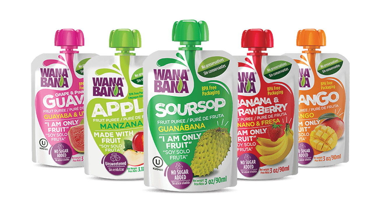
Innovating the fruit market.
The main objective of this project was to create a brand that could connote: freshness, naturalness and be healthy. It is important to mention that one of the challenges was to communicate its main attributes in two languages: Spanish and English. In addition, we had to target a broad target group since these products are well recognized in the infant and newborn category.


A product for a wide market segment.
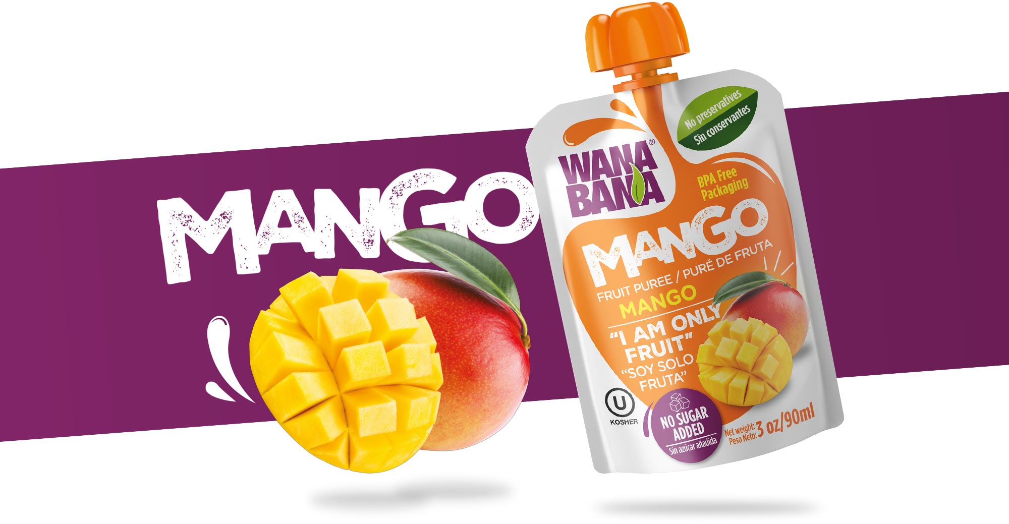
The solution for this project was to create a form that suggests the extraction of the fruit, in addition to being able to generate a focal point for the rapid differentiation between each flavor. The white background helps to emphasize the naturalness and freshness of the product. The typographic style is represented by the well-known markets in Latin America that normally go to buy fresh fruit.


