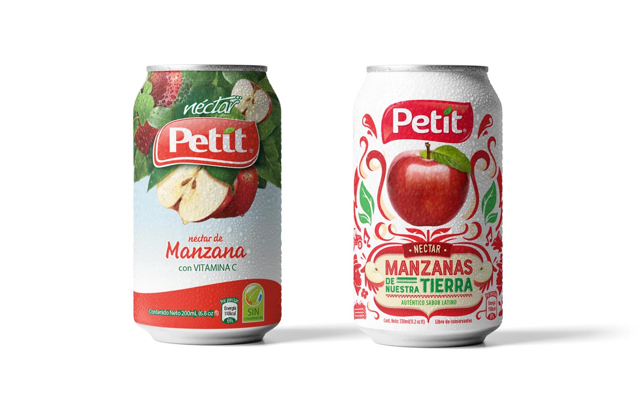
Nutrition, origin and love for ours.
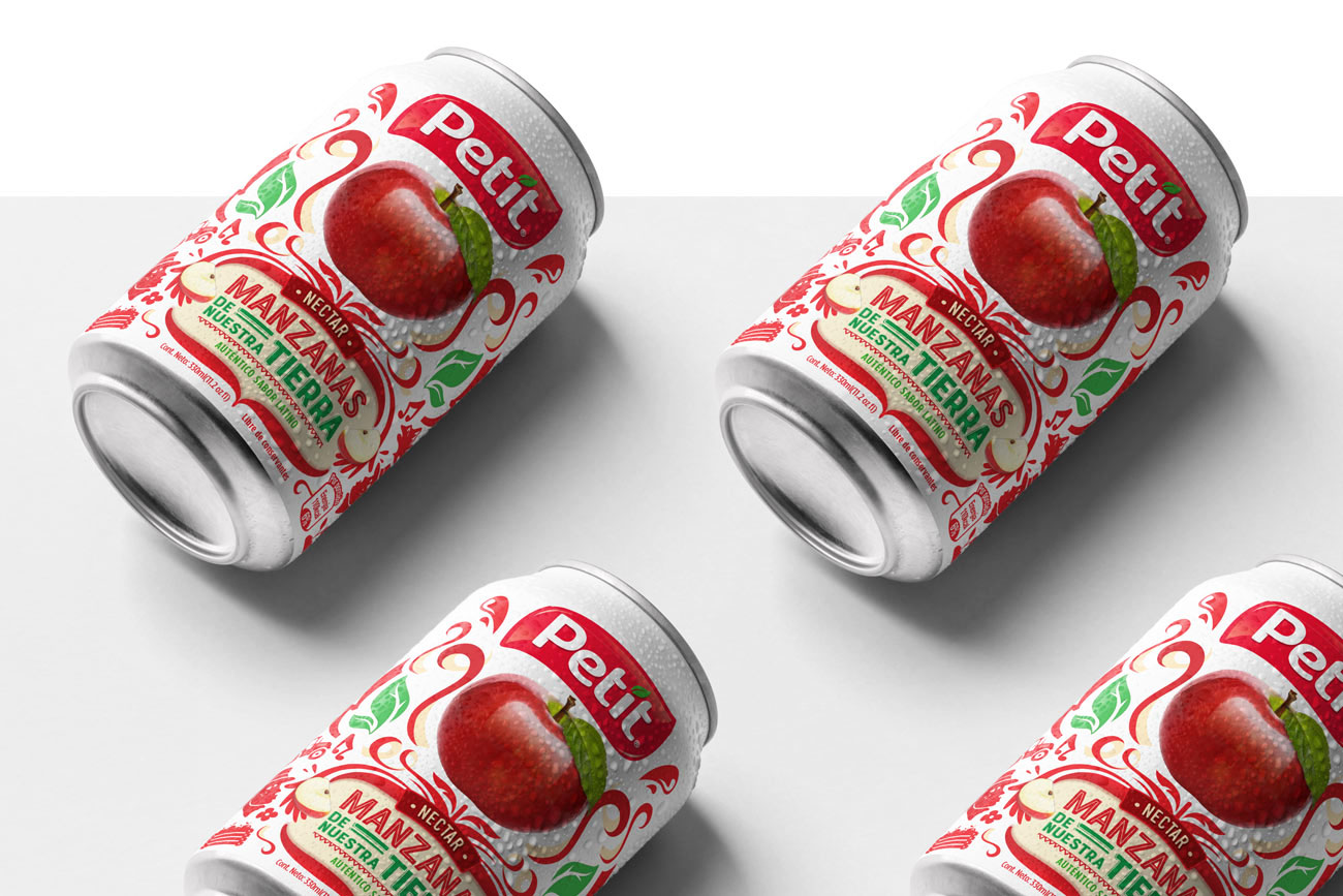
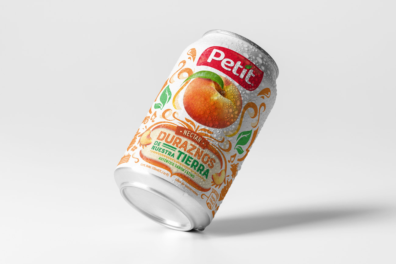
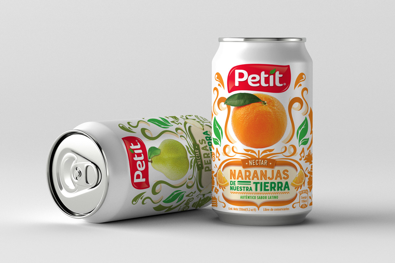
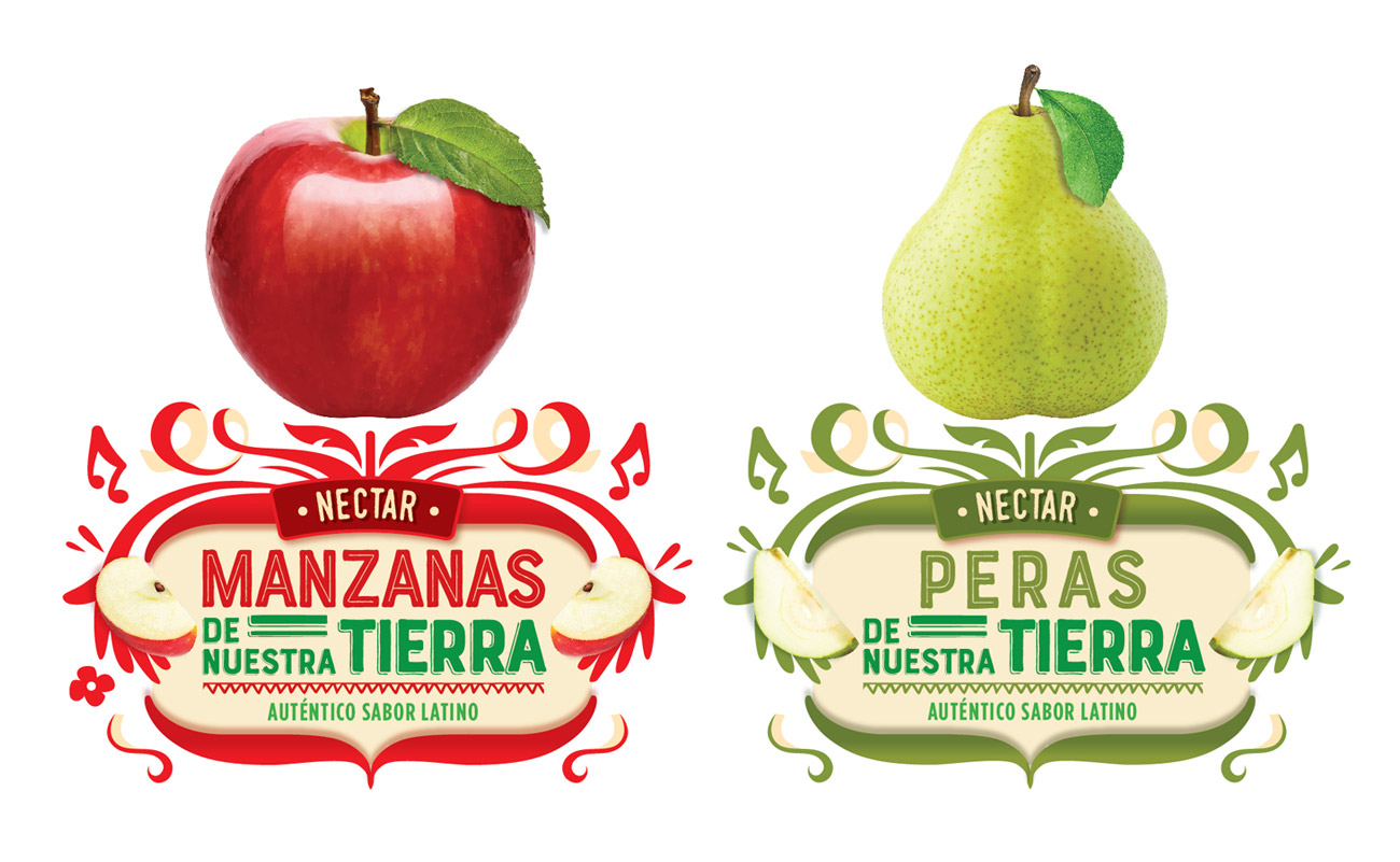
Communication through packaging.
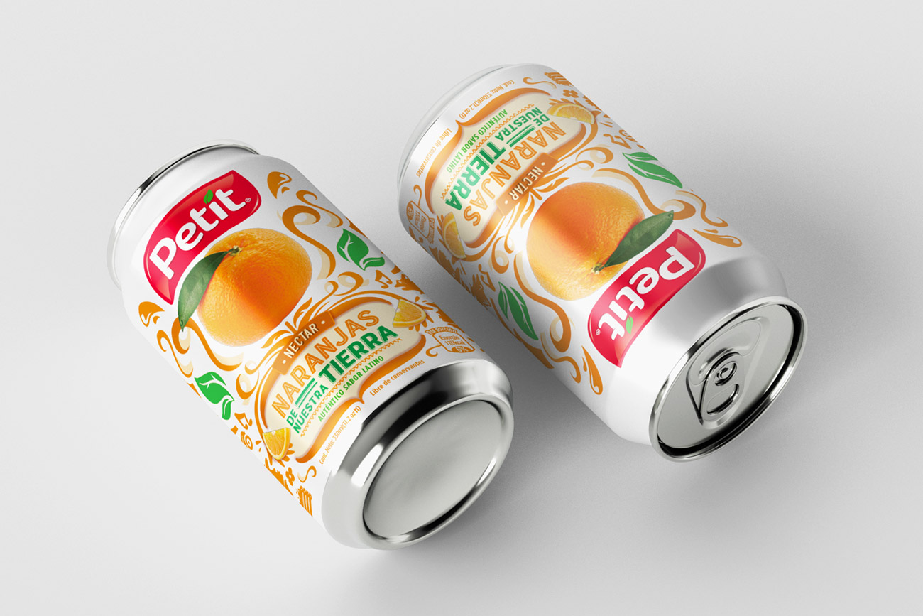
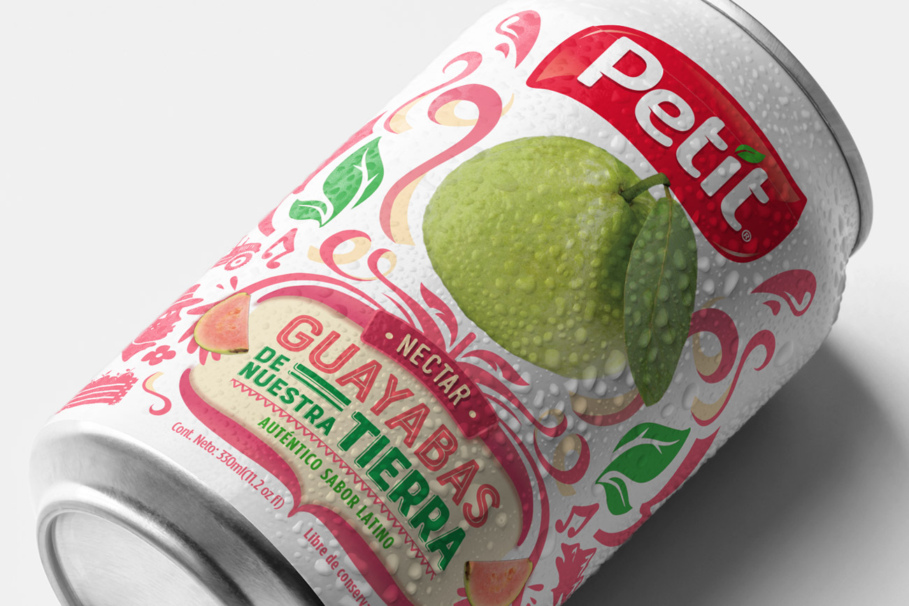
Revitalizing the brand.


Nutrition, origin and love for ours.
We were in charge of redesigning the Petit Néctar product line. After the brand changed its core values, it was forced to change its line of communication. Petit is now a brand that leverages pride and a sense of belonging towards the local. This generates in its consumers the knowledge that its ingredients are inspired by their land and that they are products made by local hands.


Communication through packaging.
In this development we were in charge of redesign the brand without losing its main values and its form that has maintained it over the years. The logo was restructured since the typography had a classic and old style. The brand lacked a structured form and was visually rebuilt through the use of a constructive grid. The same that generated a visual balance between the two opposite edges of the brand among the free space around it.


Revitalizing the brand.
One of the most important factors was the need to modernize the brand. Its initial essence and aesthetics were maintained, however we restructured the brand through the use of a constructive grid; This allows us to have a visually balanced and geometrically proportional logo. From the typographic aspect we stick to the new guideline including a friendlier connotation; as it contains other product lines that target different target audiences.

