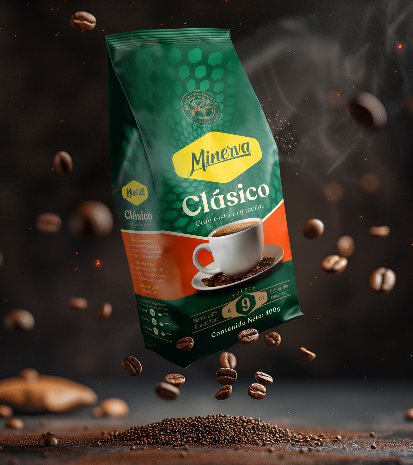
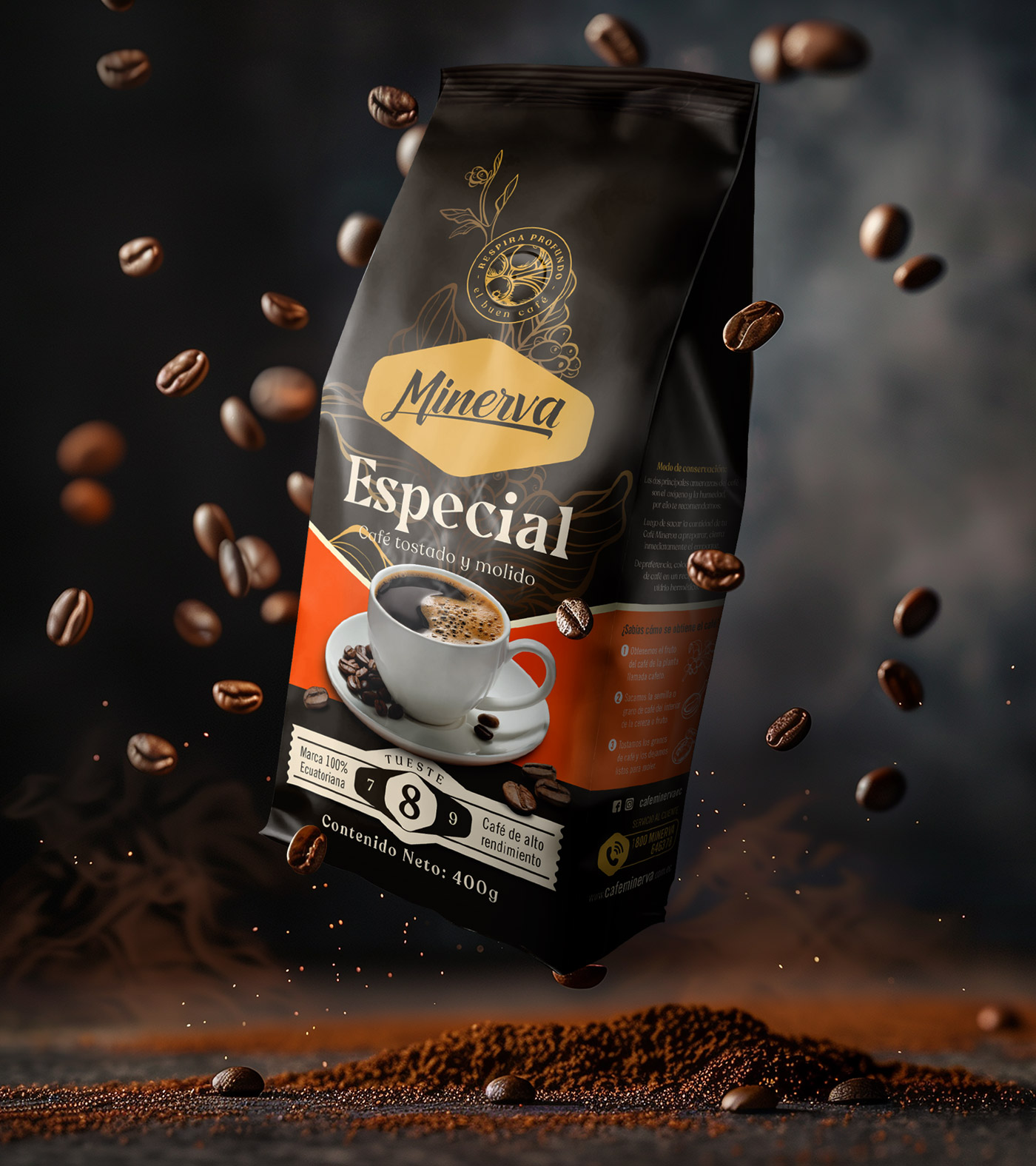
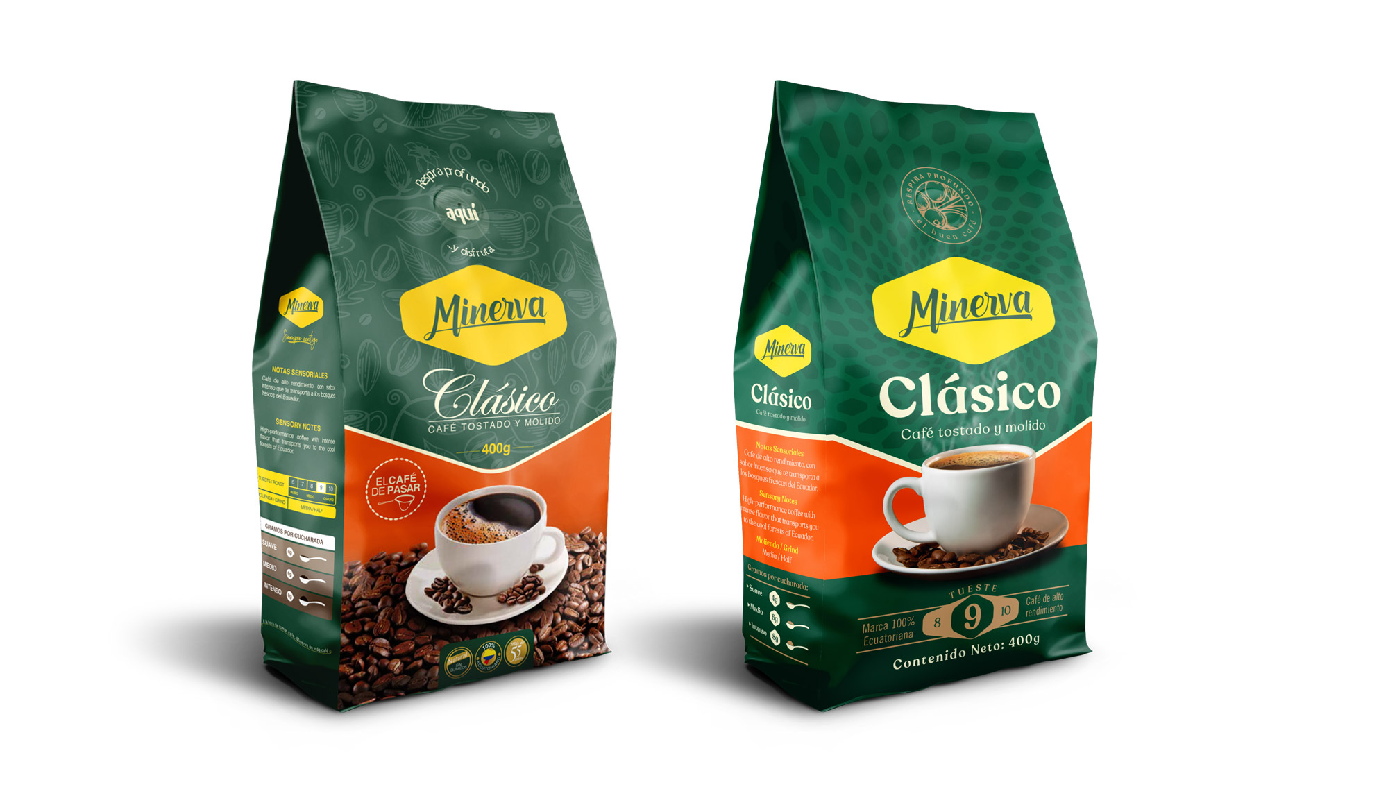
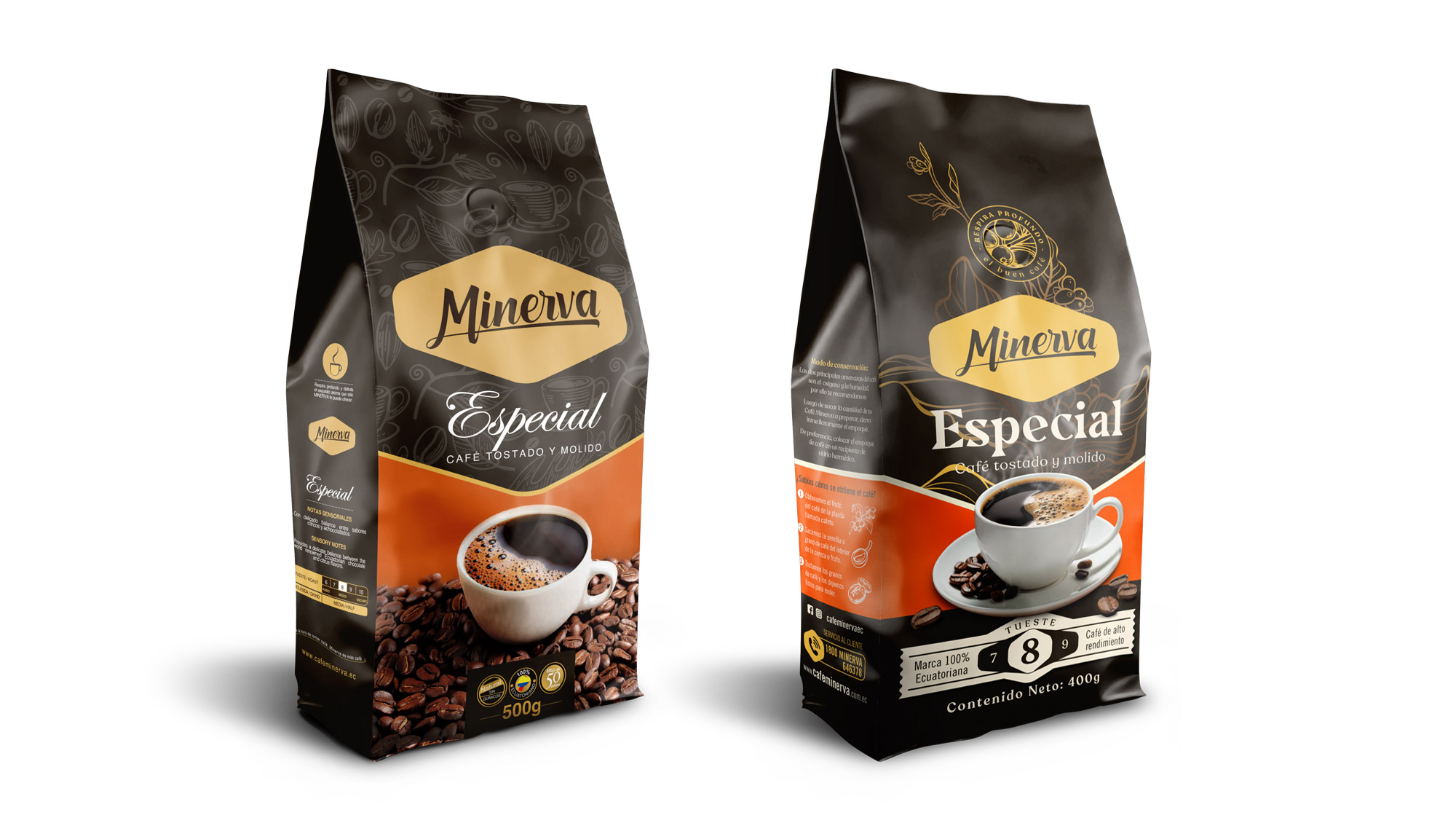
Redesigning an Ecuadorian coffee icon.
We were in charge of redesigning their packaging of one of the coffee brands with the longest history in the Ecuadorian market.
One of the most important challenges was to incorporate messages and attributes that generate a better purchase promise, but maintaining its essence and image parameters that have been maintained since its inception.


The details are what count.
During development, the elements that the consumer associated with the brand and product were identified. After this, a packaging architecture was generated that allows it to grow over time, but giving it a much more modern and current look. The important thing is that the consumer feels that their usual product has not changed, but has simply been modernized.


