Soleg

DRIED FRUITS

Sophistication and simplicity as brand hallmarks.
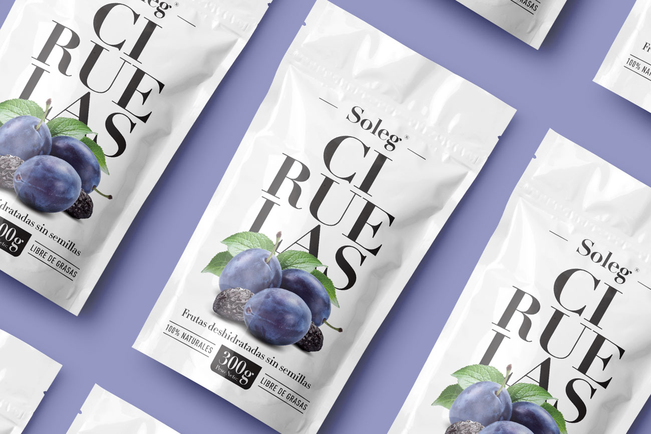
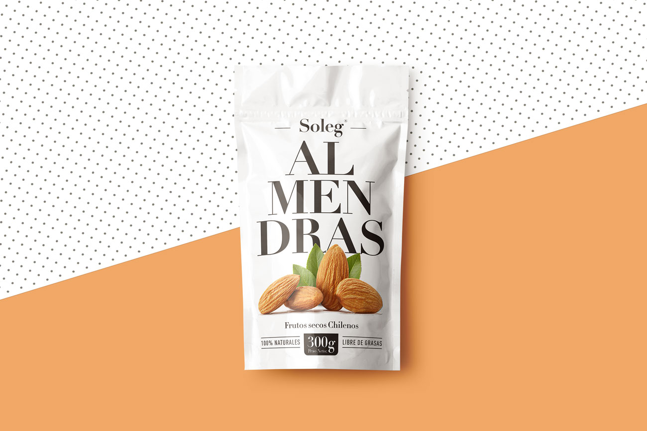
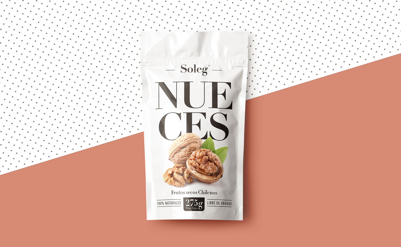
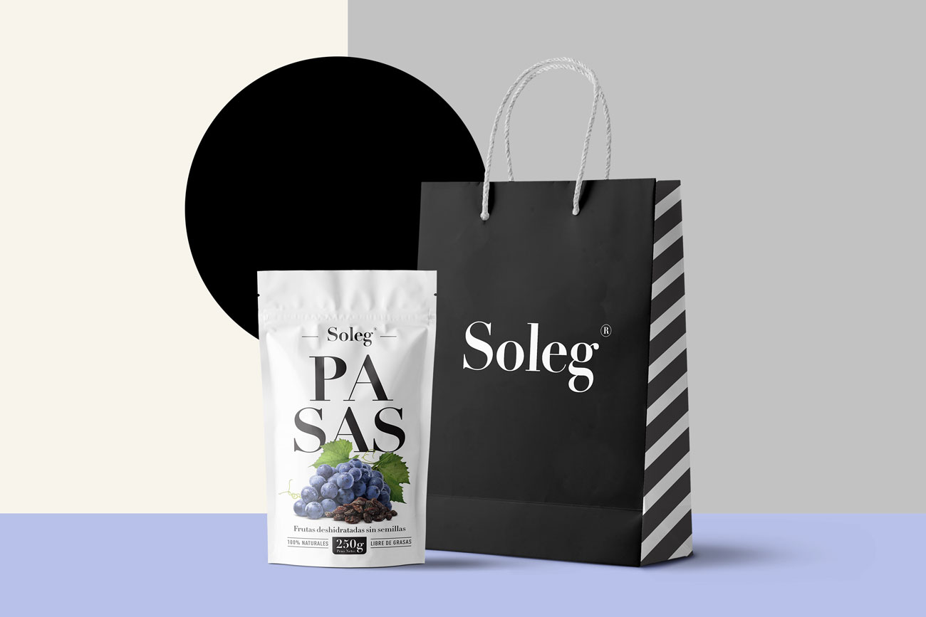
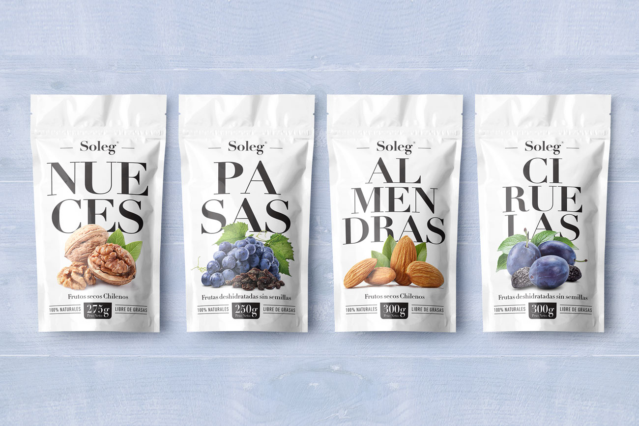
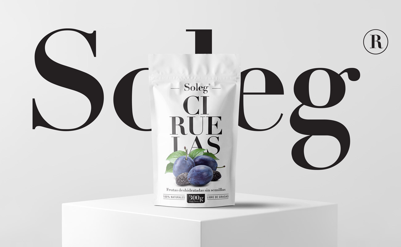
We were in charge of developing a packaging line for the Ecuadorian market. Through typographic use we break the words of the ingredient to give dynamism to the design. This system allows us to adapt any product of this line and generate a sustainable brand architecture over time. The chromatic use allows us to highlight the photograph of the product generating a harmony and balance between all the visual elements.

WEBSITE
Clap Award - Gworkshop Design
Favourite Design - Gworkshop Design
Packaging of the World
Soleg - Gworkshop Design | Packaging & Branding studio

Brand Architecture.

The idea of ​​this project was to generate an elegant and sophisticated connotation, in addition to the harmony and cleanliness among its elements. This allows the products to stand out on their own. What makes this proposal innovative in the market. It is the use of the "Didot" typography that presents a high contrast between the thin lines and the thick verticals against the beauty of photography.
Soleg - Gworkshop Design | Packaging & Branding studio
Privacy Settings
We use cookies to enhance your experience while using our website. If you are using our Services via a browser you can restrict, block or remove cookies through your web browser settings. We also use content and scripts from third parties that may use tracking technologies. You can selectively provide your consent below to allow such third party embeds. For complete information about the cookies we use, data we collect and how we process them, please check our Privacy Policy
Youtube
Consent to display content from - Youtube
Vimeo
Consent to display content from - Vimeo
Google Maps
Consent to display content from - Google